Photographic Projects > NY Times Series, 2016-ongoing
NY Times Series, 2016-ongoing
NY TIMES SERIES
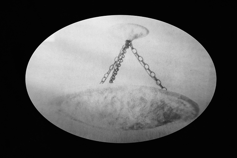
Working from a collection of high end real estate ads saved from the Sunday New York Times, each image is scanned at a high resolution, and assessed for elements in the composition that could be overlooked, such as, geometric anomalies or decorative objects used to make the space more visually appealing. Cropping in tightly on the these elements to create interesting formal compositions, they are then digitally manipulated to enhance properties such as value range, contrast, focus, or image quality. The images are then printed on metal instead of paper, mimicking an alternative printing process known as, liquid light. In the “Grid Series”(2017), each of the 9 panels varies in terms of subject matter, but also in surface quality. The panel directly in the center of the grouping, has a range of soft grey tones throughout, reminiscent of a graphite drawing, whereas the panel on the bottom right, embodies rigid geometric forms, printed with more contrast. “Chandelier” (2016) printed in a soft focus, creates a weightless, dreamlike structure contrary to its form.
The inception of this project grew out of a weekly ritual which invoked frustration instead of pleasure; viewing luxury property ownership ads. Attainable to only a select “few”, these images are “borrowed” from an aspect of these ads that is accessible to all, the printed form itself. Collecting and altering them does not require status nor, the act of ownership, they simply require the desire to find pleasure in the act of making. By re-contextualizing these images, the once visceral reaction to these ads hence, diminishes.


